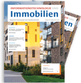
Everything in one line – an overview of IT&I’s new design
In terms of content, the same high quality awaits you with useful tips, exciting insights into other companies and a host of valuable information. Visually, we are concentrating more than ever on clear lines, an open, user-friendly layout and supporting illustrations.
At first glance
To make our magazine an even more ideal companion when on the go, we have transformed it into a modern compact edition. Perfectly formed for any handbag, IT&I will accompany you on boring train journeys or in dismal airport departure lounges with a wealth of exciting topics. The cover of IT&I has also had a bit of a makeover. With fewer colours, our focus is now on the topics contained in the issue.
It’s all clear now! Providing an optimum reading experience with a cleaner design
To provide that additional bit of reading pleasure, we have optimised the magazine’s layout and design in key areas. For example, our titles as well as our figures and illustrations now have more free room on the page. The removal of bold decorative bars rounds off the new, clean overall appearance. This draws the reader’s eye to what is important. Our new font also has the same aim: greater clarity! Omitting serifs makes it easier for our brains to recognise the text. Large images introducing the article topics help make it more enjoyable to leaf through.
Things you can rely on
Various smaller and larger changes to the design of IT&I make the magazine a completely harmonious medium for anyone interested in the real-estate industry. They are guaranteed the usual high-quality content on strategy, law, reference, solutions and our own company. Not yet subscribed to the print edition? Then register for the next issue now.


