319
·
04/10/2016
About PROMOS
On to new summits
Ever since the company was founded, PROMOS has stood for competence, innovation and success based on experience. The name was taken, over 18 years ago, from the 2194 metre high mountain Promos. This blue-shimmering peak, located in the Carnic Alps, is a symbol of strength and endurance. The summit of Promos has always been the main theme in the company logo, which was given an impressive new look in 2016. It was therefore a good time to give the corporate website a facelift too…
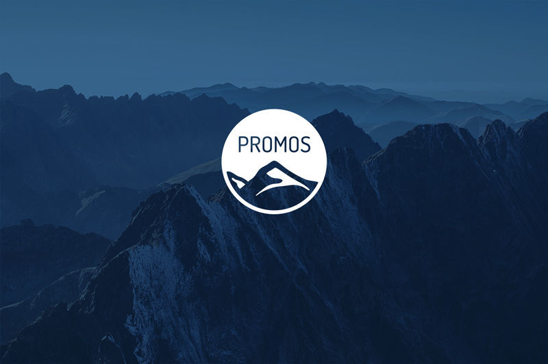
Just like its counterpart in real life, the new PROMOS logo sparkles in a beautiful blue and its mountain range, based on the original, is even more in line with the company’s origins – impressive, strong and modern at the same time. The fact that the company was named after this mountain range in the midst of the Italian-Austrian border area can be attributed to the enthusiasm for mountaineering of the company’s founding members and has always played a key role in the company’s history. Employees climbed to the summit of their mountain together in 2008 to celebrate the company’s 10th anniversary. Just like a mountaineer, PROMOS still to this day has important characteristics that are essential for success, namely courage, creativity and endurance. Bringing the summit even further into the foreground in the logo therefore seemed the obvious thing to do. The new look will be presented for the first time at this year’s Expo Real.
Design in its pure form
With a view to providing a modern home for the logo online, the slightly outdated PROMOS website has also been revamped and given a new, modern design. With refreshing and inspiring imagery, the site guides users directly to just what they are looking for. As a result, the content that was already provided before the restructuring can now be found even more quickly. “In designing the new website, we have paid particular attention to user friendliness. Thanks to a functional, solution-oriented colour scheme, combined with stringent use of self-explanatory icons, users can easily find their way around the site and obtain precisely the information that they need,” describes Jens Kramer, CEO of PROMOS. Another feature of the concept developed is the new responsive design. Regardless of whether it is accessed in the office with a 20-inch laptop display or from a tablet PC while on the move, the PROMOS website flexibly adapts to its environment. There are never any cumbersome horizontal scroll bars that have a detrimental effect on functionality and manageability. The arrangement and design of control elements is automatically calibrated to the terminal device you are currently using.
As an all-round supplier of solutions regarding all aspects of real estate, we consider it to be our obligation to provide existing and potential customers with the opportunity to obtain detailed information about us and our services on the web.
PROMOS opens its treasure chest
The new PROMOS website places a great emphasis on the company’s broad portfolio. “As an all-round supplier of solutions regarding all aspects of real estate, we consider it to be our obligation to provide existing and potential customers with the opportunity to obtain detailed information about us and our services on the web. With the new website, we are more than ever before pursuing a type of open book policy. This approach, which is to date unprecedented in comparison with the competition, already proved to be the right way to go for our open solution library PROMOS.GT. Descriptions, screenshots and information graphics for products, features and services are at the free disposal of everyone with immediate effect,” states Kramer, by way of explanation of the clearly compressed information offered on the website. This is supplemented by useful additional functions for visitors. For example, there is a wish list function for all products. In a similar way to using a bookmark, users can flag products that are of particular interest in order to come back to them at a later point in time. In addition, they can now download relevant information in the form of a clearly structured product data sheet in PDF format at the press of a button.
Newsflash
The new website design has also been applied to the PROMOS newsletter, which is sent out once a month. The responsive design is worthy of particular mention here, too. After all, how often do people read their e-mails on the move nowadays using their smartphone or tablet PC rather than sitting at the PC? In view of this, rigid formats with oversized images and incorrect text wrapping are the horror of every reader. This no longer poses a problem with the redesigned newsletter tailored to the needs of recipients. It goes without saying that readers still obtain the practical topics that they had before.

Figure 1: The new design of the PROMOS website adapts to the requirements of various terminal devices in an optimal way.
Successful overall performance
The new PROMOS corporate identity gives
rise to a coherent, modern overall concept. The open, innovative and
simultaneously bold company policy is reflected in all areas of communication.
Moreover, it is not only obvious things, such as the new logo on commercial documents,
that give a great impression, but sometimes also small hidden puzzle pieces
that form a whole later on. “Just visit the website and take a look for
yourself,” concludes Kramer with a wink.
redaktion@openpromos.de