595
·
21/10/2020
Solution
The easysquare reporting app – the independently developed reporting tool
easysquare offers the height of comfort with this product innovation. Owners and investors with property that is managed by third parties – and that potentially have multiple portfolios – now have the opportunity to view the key figures relating to their properties at all times and in a structured way.
You cannot reach good decisions without facts and knowledge. Bringing these two things together and putting them in the right context requires time and cumbersome research. The challenge is often not missing information, but the sheer profusion of it that is constantly making it more difficult to extract relevant information from the flood of data and reach the right conclusions. This is precisely why we developed the easysquare reporting app, which analyses, processes and graphically illustrates relevant data from the real estate industry. The goal is to clearly present information to aid in decision-making. This makes the reporting app an ideal supplemental tool for property owners and investors who want to obtain a basis for the convenient, structured administration of real estate. As well as important key performance indicators, information on the portfolio (for instance property master data, rental income, vacancy rates, tenant turnover and maintenance tasks) can be accessed conveniently in the app. This can reveal unseen connections and enable better forecasts.

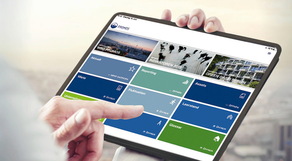
Figure 1: The reporting app clearly displays all crucial key performance indicators and assessments of the portfolio. Five types of diagram are available for the graphic visualisation.
A standard for quick introduction
Easy to implement, the reporting app represents an efficient alternative to complex, time-consuming evaluations. To ensure a quick introduction process, standard reports were implemented that cover a wide range of problems. The contents of the standard reports are generated with HTML5 source code and displayed in individual forms.
The structure of the reports is based on the following three visualisation elements:
- Key performance indicator fields
- Diagrams (with axis labels and key)
- Tables
The key performance indicator fields can display important individual values such as absolute and relative indicators. In turn, the diagrams represent processes and connections. The interactive design allows the user to select and highlight certain diagram elements while using the app. To ensure maximum information transparency, individual values from the respective diagrams can also be represented in tables.
Five types of diagram are available for the graphic visualisation:
- Pie chart
- Bar chart
- Column diagram
- Line diagram
- Combination diagram
Pie and bar charts are particularly suitable for comparing various characteristics of a situation, although a pie chart can only map a limited number of characteristics to maintain an overview. Line and column diagrams, on the other hand, are better for representing tendencies and progressions, with the option to evaluate additional variants through colour groupings. In a combination diagram, the addition of columns and lines enables evaluation of various aspects within a diagram, such as the comparison of absolute and relative progressions.

The path from source to destination
To ensure that the reports always contain the most current information, they must regularly be provided with the appropriate data. The origin of the data plays a crucial role here. In the default set up, the reporting app operates through a data connection to the ERP system. However, alternative data sources such as Excel tables can potentially also be used. Another prerequisite for successful reporting is the persistence, or completeness, of the source data. Lacking persistence may lead to additional effort being required during data processing. Data preparation entails its analysis, harmonisation and, if necessary, aggregation. This phase also includes the calculation of key performance indicators. Depending on the scope and quality of the source data, this may also require the creation of a data model in order to establish the relationships between the individual data sets. The finished key performance indicators and further information can subsequently be transferred to the standard reports. An additional interface is provided for this. The diagrams also show chronological developments by month over the course of a year. Data is therefore integrated into the reports with reference to a key date at the end of the current month. The column and line diagrams thus each show twelve values that are added for each month and saved in one-year timeframes. Historisation of data across several years is not supported in the standard solution, though it can be commissioned if needed. This can be of use if you want to compare the developments of previous years with each other, for instance. An additional filter would be implemented in the box list for this where the relevant year can be selected. Further criteria other than chronological aspects can also be filtered, such as the accounting entity, use type or status. The possible filters and the amount of effort required must be determined on an individual basis using the source data. The simultaneous combination of multiple filters is not possible in the standard solution at this time.
The reporting app is an ideal supplemental tool for property owners and investors who want to obtain a basis for convenient, structured real estate administration.
Many extras and application possibilities
The finished reports can be displayed in their own environment in the easysquare reporting app. In addition to the actual evaluations, other situations can also be represented in the reporting app.
The standard app currently contains the following form overviews for:
- Master data, land register, portfolio for the individual assets
- Individual new construction projects
- Presentation of one’s own company
- News, deals and appointments
- Contact partners and contact data
- Mapping of economic indicators
- And a glossary with search function.
Which additional information should be mapped depends on the individual subject of the evaluation, since the reporting app has a large number of possible applications. Aside from real estate data, consumption data can also be evaluated according to the new Energy Efficiency Directive, for instance. The standard reports can also be implemented as additional tiles in all existing easysquare apps. This makes the reporting app a true all-rounder that impresses on multiple fronts and guarantees clarity at all times.
Author:

Elias Manhart
Junior Product Manager
PROMOS consult
Other articles by this author: